Visualization
One of the big problems in analyzing the output of complex systems is figuring out a way to visualize the answers
that are contained within large data sets.
Two techniques that can help this process are animation and 3-d plotting.
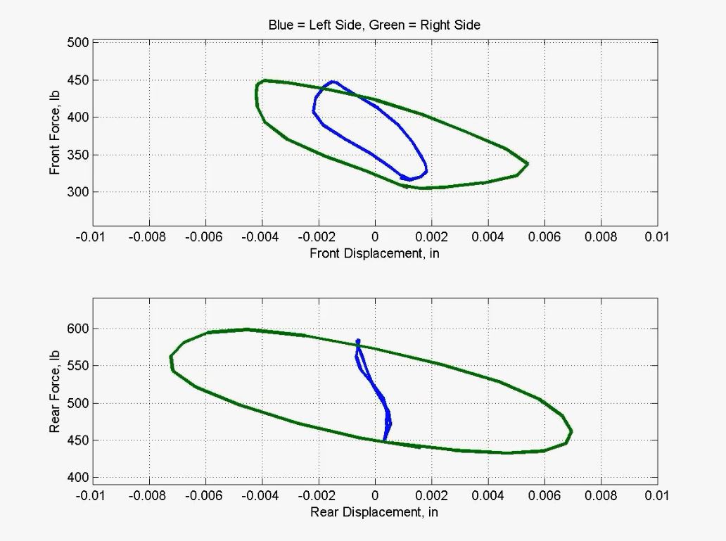
Below is an animation of data that was taken to try to find the source of a friction problem. A system was driven
with a low-amplitude sine wave, and each of four joints was examined for evidence of "breaking free". That is, the
expectation was that the joints would exhibit NO displacement at all until the force oscillation exceeded the static
friction (or "stiction"), and then would move freely. Unfortunately, the reality did not work that way, and the "breakaway"
was not discernable in straight time plots of the variables.
Click on the picture below to play the video showing the simple animation of relevant data segments:
To visualize what was actually happening with the variables, the data was cut into single-sine-wave slices.
Next, cross-plots of the force versus displacement were generated for each slice. Finally, successive cross-plots
were projected as an animation. With this visualization, it was easy to see that the friction problem was most
pronounced on the left side, particularly on the left rear (lower blue plot), and that the right side exhibited
little friction at all.
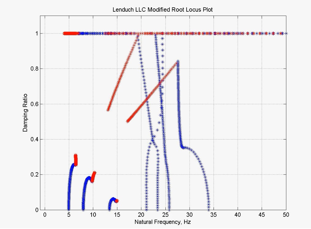
This technique of animating data plots (easily done within Matlab) has been used successfully by Lenduch LLC
on numerous occasions to facilitate understanding of the results embedded within large data sets. Also, it has
been used to translate the nonintuitive (to most engineers) root-locus plots into an animation of the
"natural frequency - damping ratio" plot that is variously known as the "Duchnowski Plot" or the "Missile Plot"
(for obvious reasons, which you'll see when you click on the display below to watch the animation):
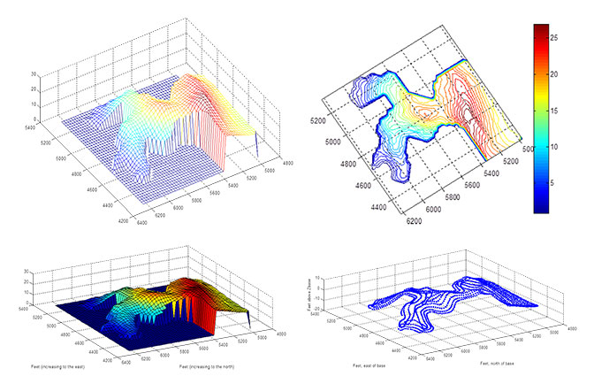
Another common technique is to generate 3-dimensional plots, which can be interactively rotated and examined
from different angles and perspectives within Matlab. The four plots below show the contour of a 15-acre grain field,
and illustrate types of plots that are easily generated within Matlab, and thus commonly used.
These examples illustrate the graphical techniques that can sometimes be used to get information and insight
from large blocks of data that are hard to assimilate in their native formats.